BRAND GUIDE · V1 · JULY 2026
Curtez Riggs

The digital home for essays on leadership, trust & influence.

How the Curtez Riggs personal site looks, sounds, and behaves. Share this with anyone building on the brand.

01 · POSITIONING

Writer first. Everything else supports the story.

Curtez Riggs is a writer and leader — also a founder, veteran, and community builder, in that order. The site is an author platform, not a conference site, speaker site, or book funnel. MIC appears as proof of the ideas, never as the centerpiece. The primary goal of every page is growing the newsletter.

FEELS LIKE
Thoughtful · editorial · premium · calm · timeless · generous
THE INTERSECTION
West Point · The New Yorker · Apple · a premium hardcover leadership book
VISITORS THINK
"This person has something worth learning" — never "this person wants to impress me."
02 · WORDMARK

The signature script.

Curtez Riggs wordmark, navy
NAVY · ON LIGHT SURFACES
assets/wordmark-navy.png
Download PNG
Curtez Riggs wordmark, white
SOFT WHITE · ON NAVY / PHOTOGRAPHY
assets/wordmark-white.png
Download PNG

Sizes. 60px tall in navigation, 48px in footers, up to ~90px in headers. Never below 40px — the script loses legibility.

Clear space. Keep at least half the mark's height clear on all sides. Don't place over busy photo areas without a scrim.

Don't. Recolor, stretch, outline, or add shadows. If a mark is unavailable, set the name in Newsreader 600 as fallback.

02B · HEADSHOTS

Official headshots.

Approved press photography for media, event programs, and podcast pages. Use as delivered — no filters, recolors, or heavy crops that cut the frame.
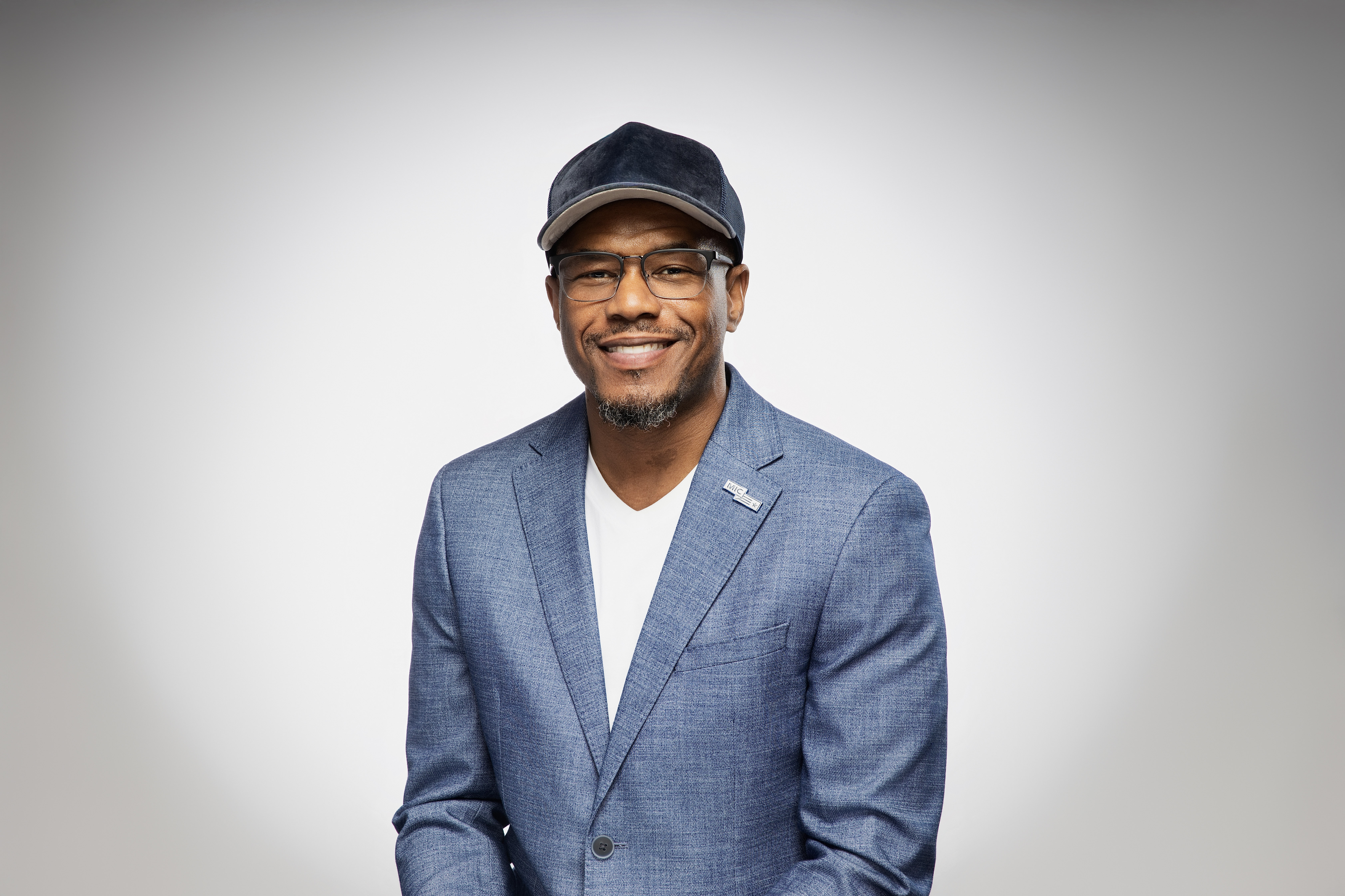
Curtez Riggs — smiling headshot
SMILING · LANDSCAPE
assets/headshot-smile.jpg
Download JPG
Curtez Riggs — arms crossed headshot
ARMS CROSSED · LANDSCAPE
assets/headshot-arms-crossed.jpg
Download JPG
Curtez Riggs — portrait headshot
SMILING · PORTRAIT
assets/headshot-portrait.jpg
Download JPG
03 · COLOR

Navy, gold, and paper.

Drawn from the MIC 2026 palette. No bright colors, no saturated blues beyond Deep Blue, no gradients as decoration. Sections alternate Soft White → Warm Sand → Midnight Navy ink blocks for rhythm.

Midnight Navy
#071A2B — ink sections, primary buttons, headlines
Deep Blue
#0D3B66 — hover states, depth on navy
Anniversary Gold
#C6A15B — accents, dashes, gold CTAs (navy text on gold)
Ink Gold
#8A6A2F — gold text links on light backgrounds (accessible)
Soft White
#FCFBF8 — primary canvas
Warm Sand
#EFE9DF — alternate band, quiet emphasis
Slate
#33475A — body copy on light
Muted Gray
#5E6E7C — metadata, captions, deks
04 · TYPOGRAPHY

Typography carries the design.

Newsreader
DISPLAY SERIF · WEIGHT 500
HEADLINES, PULL QUOTES, ESSAY BODY
ITALIC FOR EMPHASIS & QUOTES
No one is coming to hand you the mic.
Inter
BODY SANS · 400–600
UI COPY, DEKS, BUTTONS, NAV
Weekly essays on leadership, trust, and building rooms where opportunity happens — clean, quiet, and generous with whitespace.
IBM Plex Mono
UTILITY MONO · 400–500
EYEBROWS, DATES, TAGS, CAPTIONS
ESSAYS ON LEADERSHIP, TRUST & INFLUENCE

Scale. Hero 58–92px · section titles 44–64px · card titles 26–34px · body 17–21px · essay body 20–22px · mono labels 12–14px.

Signature contrast. Huge serif headlines against small tracked mono labels. Every eyebrow starts with a 28px gold dash.

Voice. Calm, reflective, confident, humble. Sentence case. No motivational clichés, no buzzwords, no emoji.

05 · ELEMENTS

Buttons, links & lists.

BUTTONS · 8PX RADIUS
Join the newsletter Get notified at launch Invite Curtez to speak

Gold = the newsletter (the one primary action). Navy = secondary actions. Outline = tertiary. Hover brightens (gold → #D4B26F, navy → Deep Blue). One gold button per screen.

TEXT LINKS & ARROWS
Read the essay → More about Curtez →

Arrow links never wrap (white-space:nowrap). Gold-underlined links for featured actions; hairline-underlined navy for quiet ones. Links shift to Ink Gold on hover. Never link to content that doesn't exist yet.

EDITORIAL LIST ROW
Trust That Travels
Why trust compounds — and why most leaders spend it faster than they earn it.
JUN 2026 · 8 MIN

Hairline-divided rows: serif title, gray dek, mono metadata right-aligned. Used for essays, talks, and belief lists.
PHOTOGRAPHY
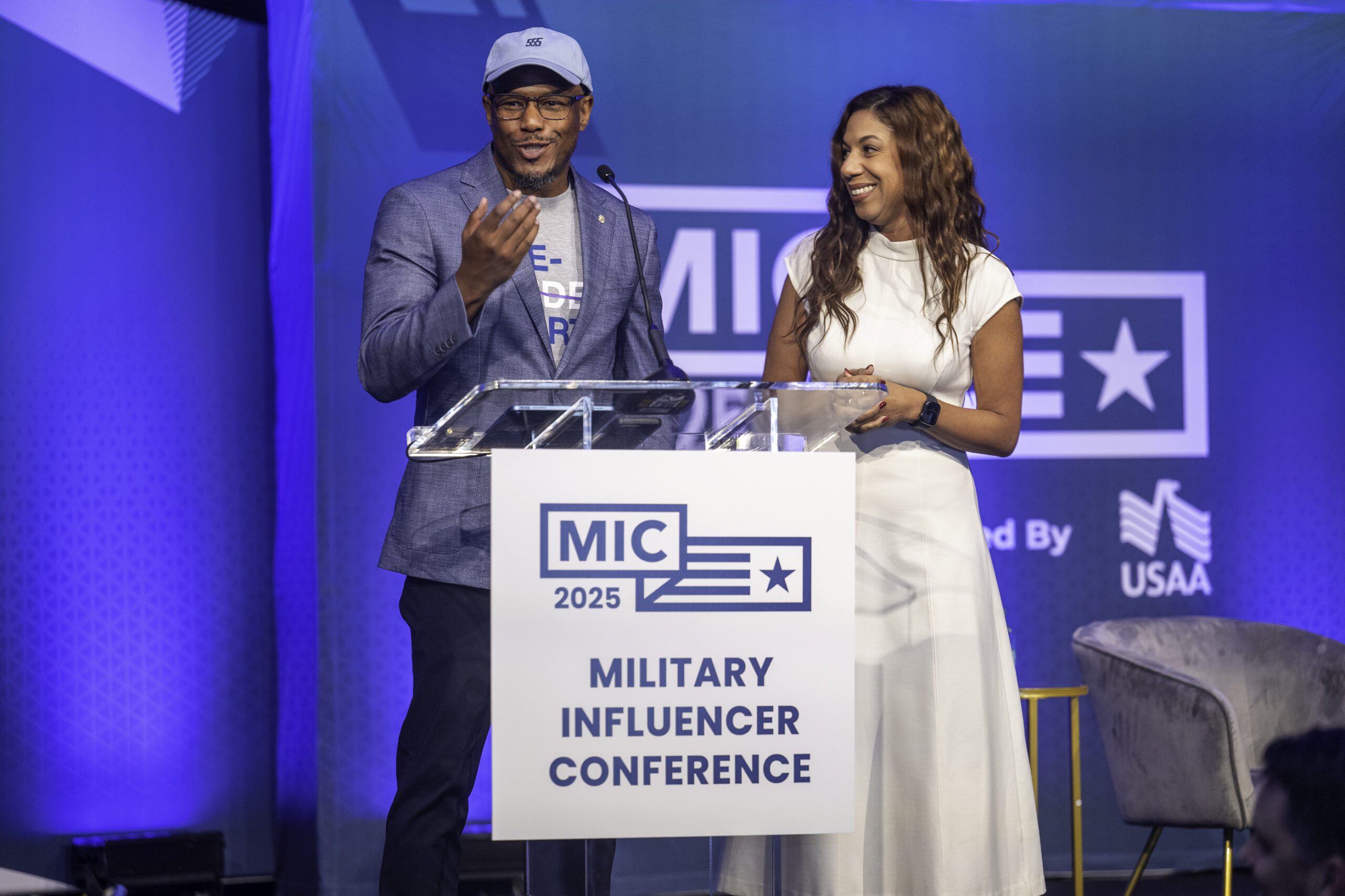
MIC stage

Authentic, documentary style: stages, conversations, community, writing. Natural color, editorial crops, 8px radius, soft navy shadows. Navy gradient scrim only when text sits on top. No stock photography, no fake boardrooms.

06 · LAYOUT & RULES

Every page should breathe.

STRUCTURE
Content column up to 1440px wide, 48px gutters; reading columns 760–1000px
Section padding 112–152px vertical — generous, Godin-scale whitespace
Band rhythm: Soft White → Warm Sand → Navy ink; never two ink blocks adjacent
Motion: soft fade-ins only, ease-out 140–420ms; no parallax, no loops
NON-NEGOTIABLES
The newsletter is the primary CTA on every page — everything else is secondary
Honesty rule: no invented endorsements, metrics, or dates — label placeholders clearly
MIC is proof, not the story — one section, never the hero
No emoji, no gradients-as-decoration, no tactical/military clichés, no bright colors